
Google Overhauls Cookie Replacement Plan After Privacy Critiques

May 6, 2022

Several things have long been regarded as “best practices” in the world of eCommerce, but many simply are ineffective. Some rules may have offered good advice in the past, but things change. On the other hand, some “best practices” have proven to be flat out wrong for many online retailers.
Now, what works for you may not work for everyone else and vice versa. Keep this in mind as you read through this list of common eCommerce best practice myths.
A lot of people believe the shorter the copy, the better. In reality, this isn’t true. What matters is the readability of your content. Are you using headings and subheadings? Are you taking advantage of bulleted lists? If not, that’s probably where your problem lies, if people aren’t engaging with your content.
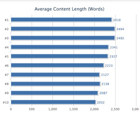
Plus, more content – assuming it’s quality content – can improve your SEO power. For one, more copy allows you to vary your use of keywords more, and it can help you a lot when trying to rank for long-tail searches. But don’t just take our word for it. Pages ranking in the top 10 results on Google for any given keyword have, on average, at least 2,000 words. On top of that, the higher you go up the list, the higher the average word count.
As early as 2003, people have questioned the three-click rule. Since then, people have consistently found that adhering to it does not make for more satisfied customers, nor do people often leave a website if they can’t reach what want in three clicks. In fact, in 2006, Jakob Nielsen and Hoa Loranger published in their book Prioritizing Web Usability that consumers were 600% more likely to find products they looked for in four clicks than they were in three.
Despite the overwhelming amount of research that contradicts the three-click rule, many designers still feel the need to adhere to it. Perhaps the three-click rule would have helped in the days of dial-up when every click meant waiting forever. But now, the three-click rule won’t necessarily help you. Making information easy to find with navigation that makes sense proves far more important than the number of clicks.
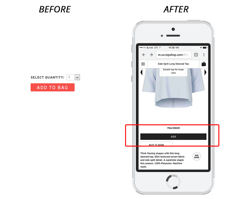
Many people say that changing the color of your CTA buttons will increase conversions. However, [Blue Stout](https://bluestout.com/blog/ecommerce-product-page-design-myths/" target="”_blank”) found through testing on Topshop’s site that increased conversions spawned from one thing: its “Add to Cart” button didn’t change color. Rather, conversions increased when the size of the button increased, even when it was a black.
The notion that all calls to action (CTAs) should exist above the fold fails to hold merit in many studies. The fact of the matter is that the quality of copy that comes before the call to action is far more important. If the copy before the CTA engages a site user, they will likely keep scrolling. On the other hand, if not enough – or simply, not quality – content shows before the call to action, visitors will lose interest. Why would a user perform a desired action?
If you can put copy that will persuade users to buy an item, subscribe to a newsletter, etc., go ahead and place your CTA above the fold. However, if more information would prove better to convince users to do something, place the CTA below the fold if you’d like.
Now, sometimes, the amount of copy before a CTA and the CTA’s placement above or below the fold doesn’t matter. Sometimes, it doesn’t affect conversions either way. However, this still offers support for the point that the fold does not hold as much weight as we often hear.
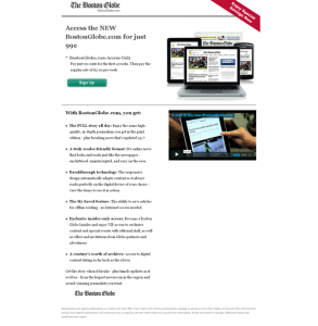
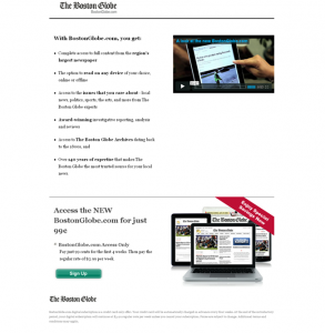
Below is one example of a test on The Boston Globe website that showed no significant difference in conversions.
Control:
Treatment:
With our knowledge of best practices, our team at Razoyo can help keep your website in tip-top shape and ensure high conversions. Contact us to learn more about how we can help you.
These links open AI platforms with pre-written prompts about this page.
We use cookies to improve your experience. Do you accept?
To find out more about the types of cookies, as well as who sends them on our website, please visit our cookie policy and privacy policy.